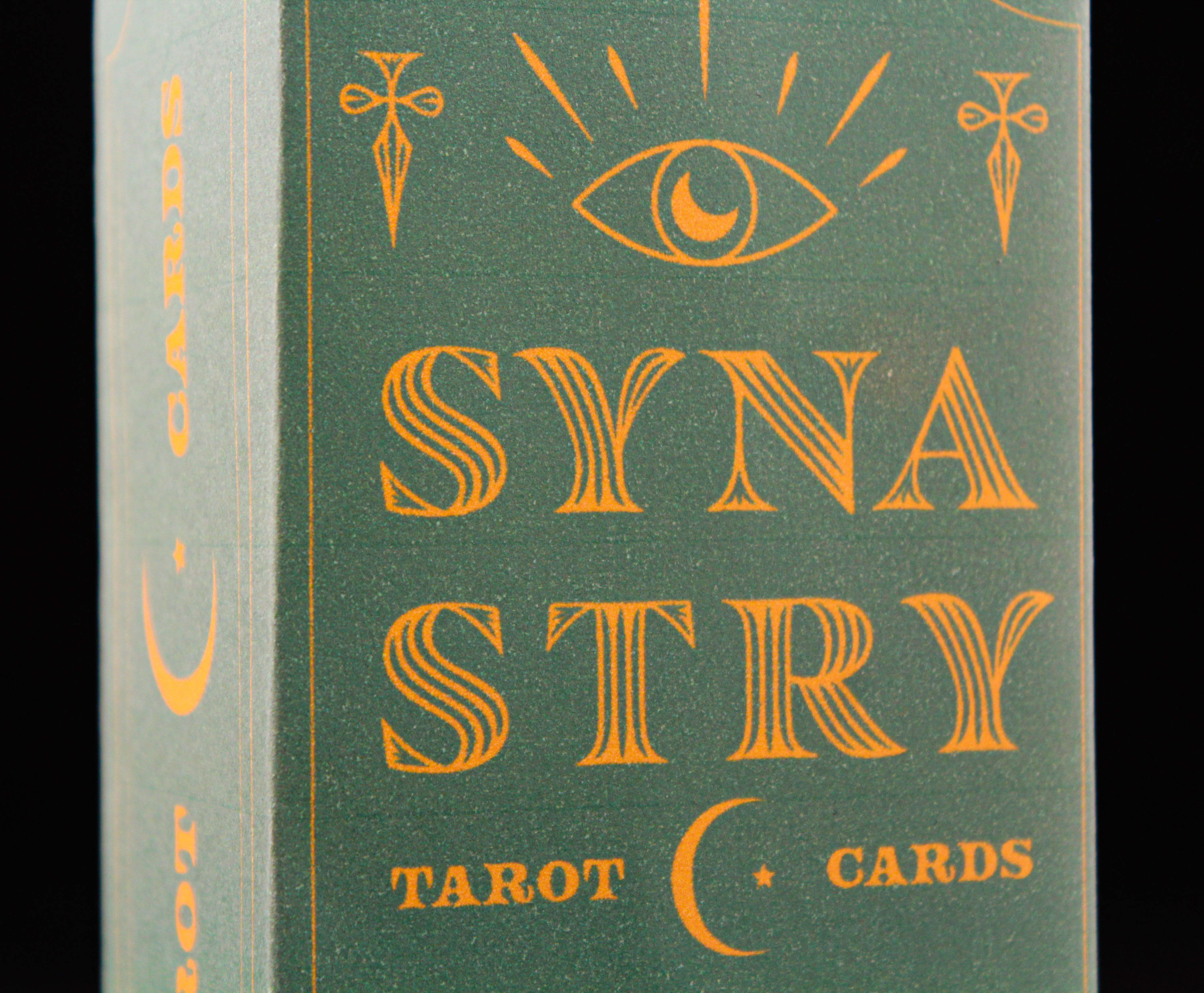
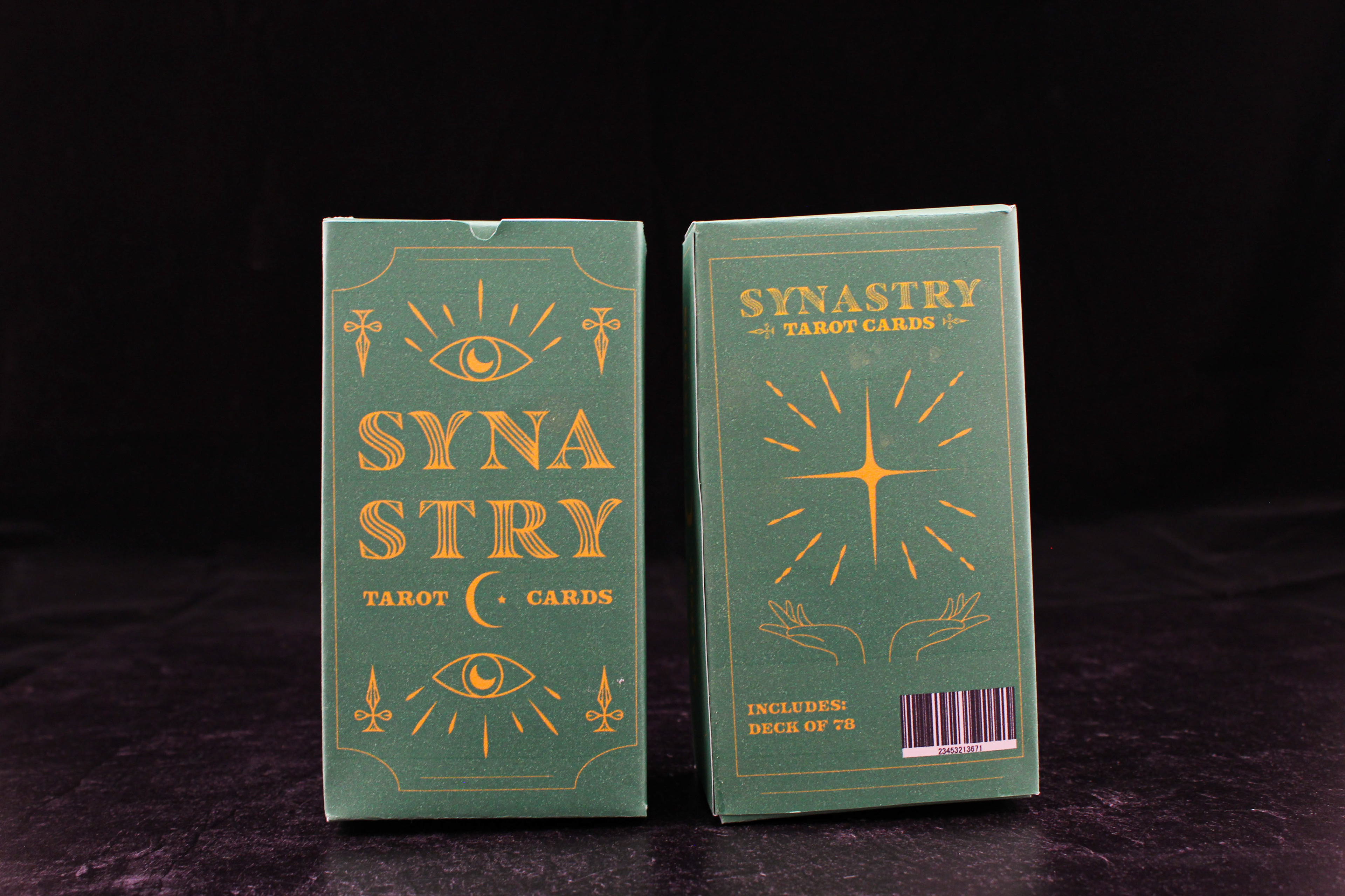
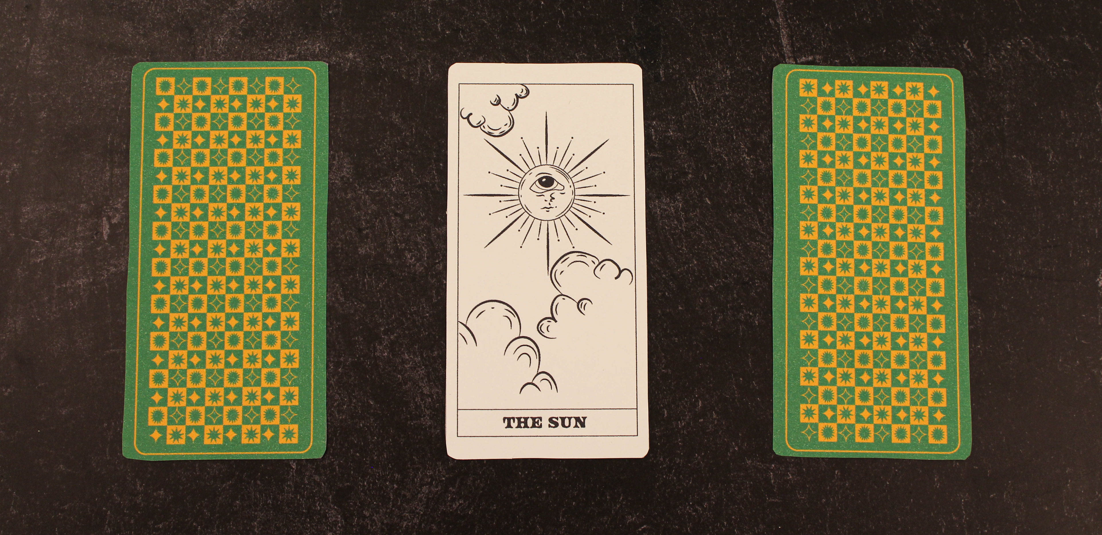
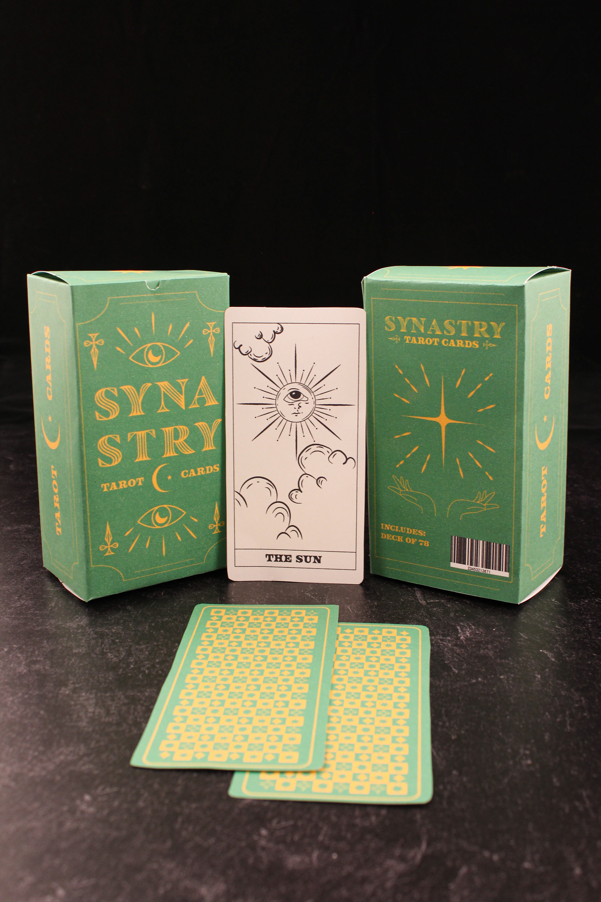
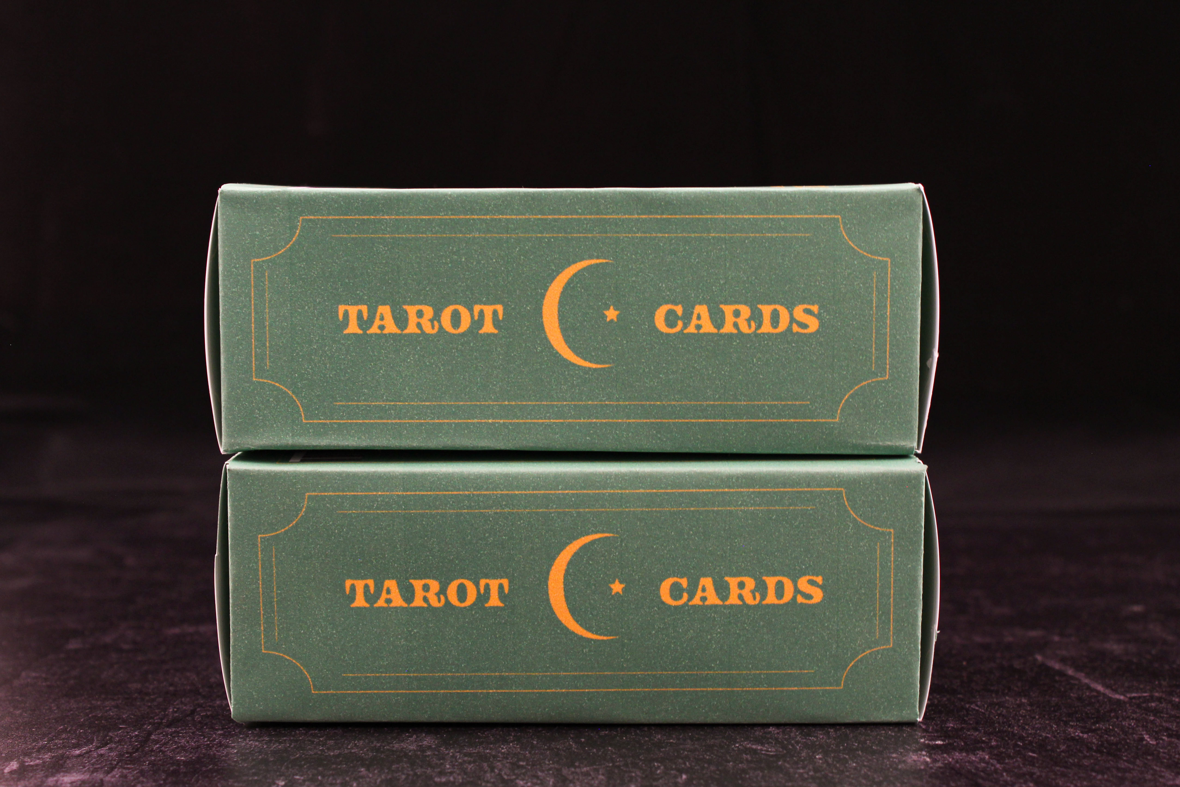
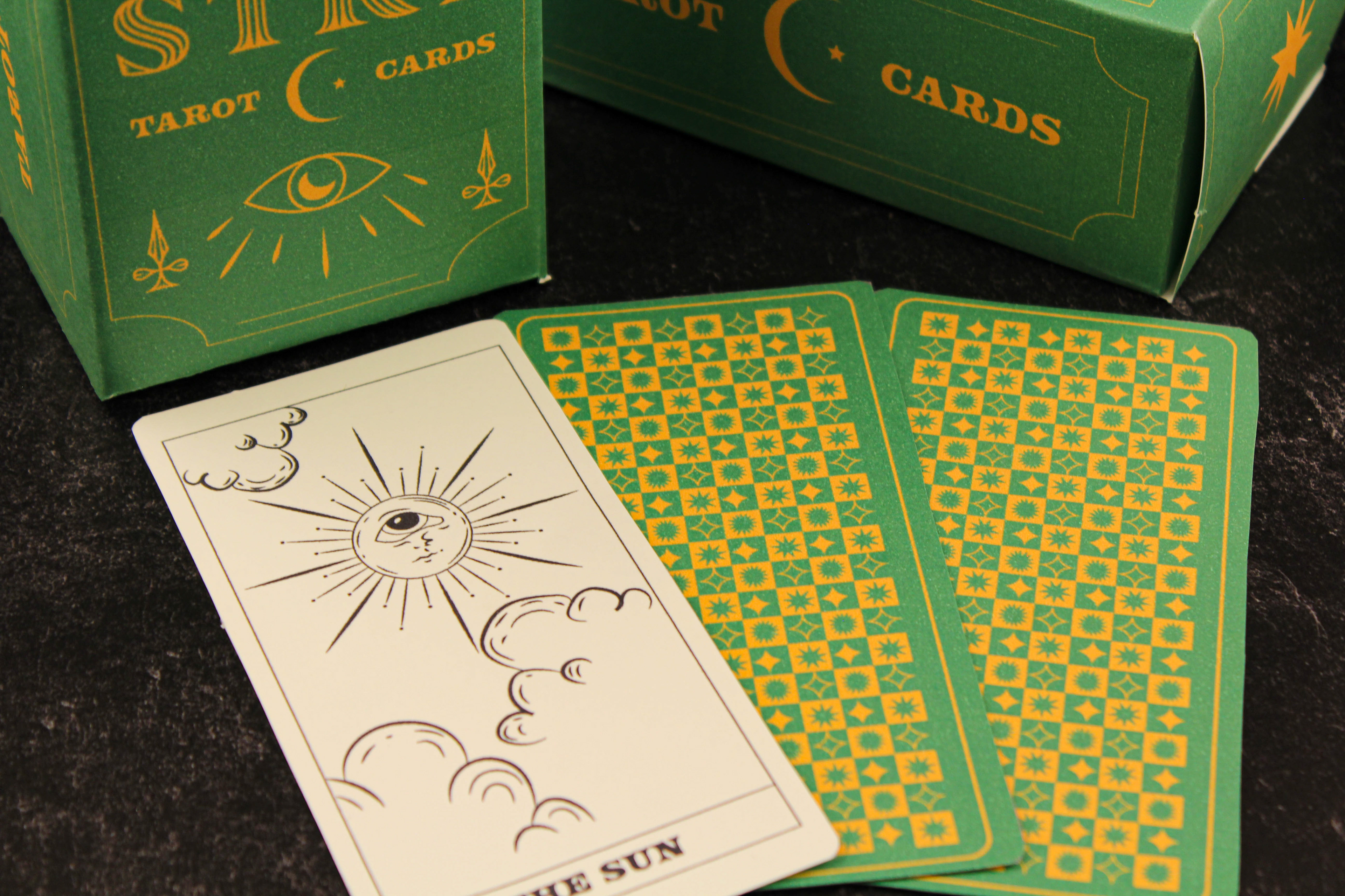
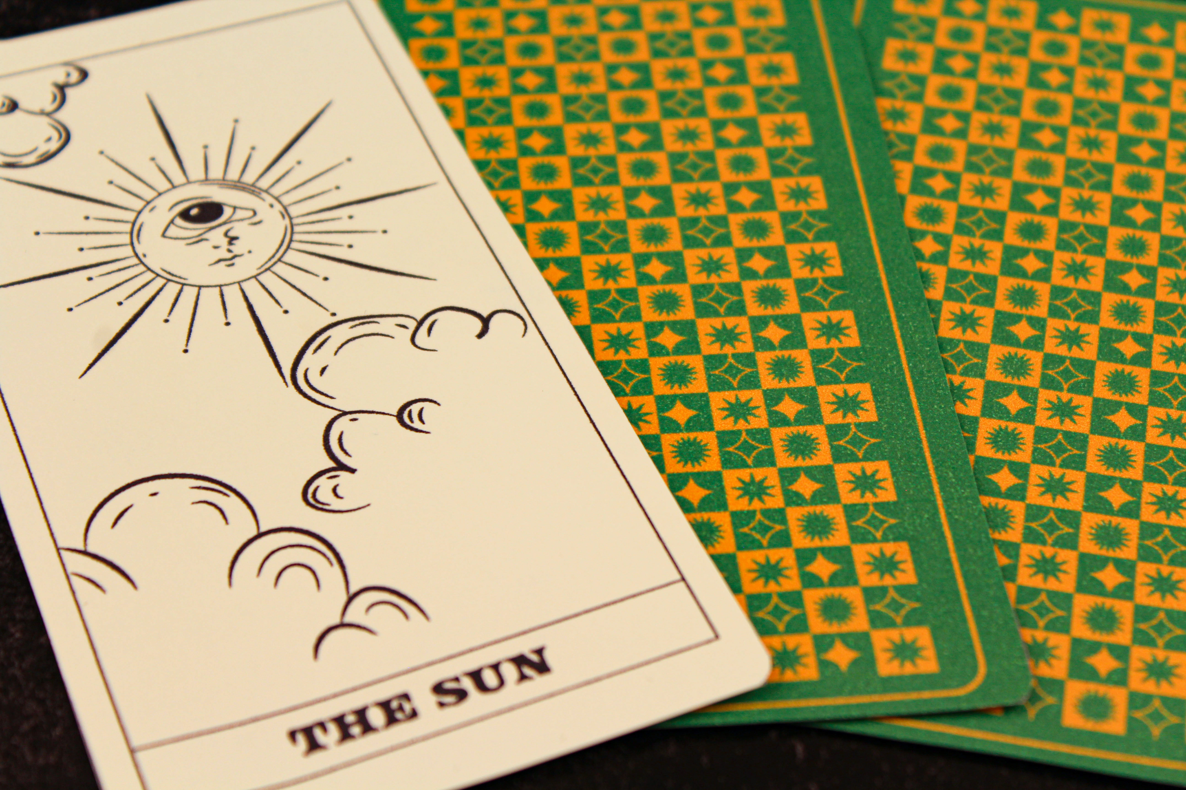
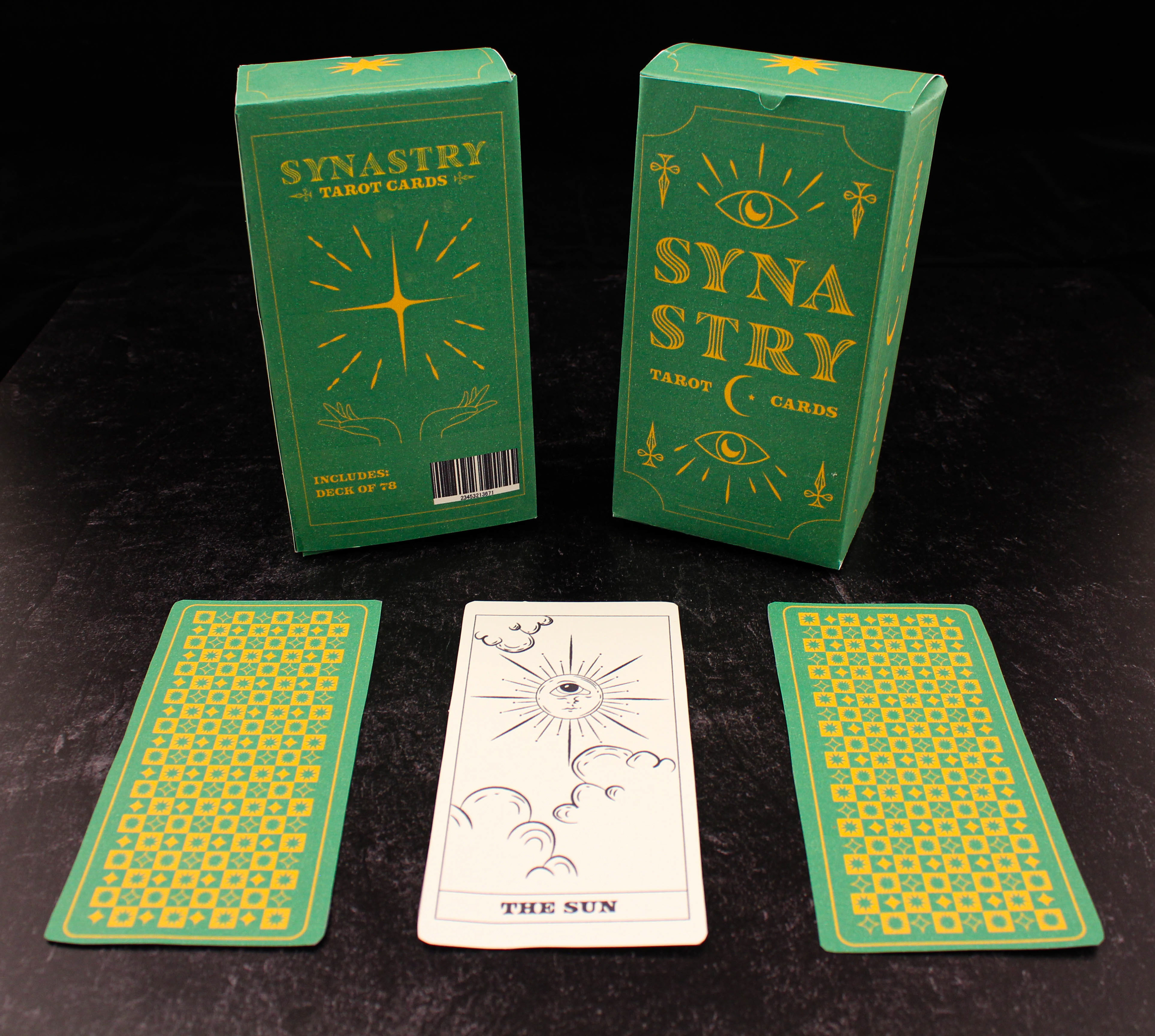
Synastry is a company that sells tarot cards in boxes. The Synastry deck includes 78 cards, each with their own imagery using celestial and astronomical symbols. I wanted to create something a little more minimal and laid back, using simple lines and shapes in my design. When deciding on typography, I wanted something whimsical but luxurious. I was between Masqualero Groove Regular and Freehouse Regular, and ultimately decided to use both with one as the main logo and the other for the subtext. Personally, I think they compliment each other very well. For the logo, I wanted it to easily fit in a square for the box design and future icons. Since the word SYNASTRY is 8 letters, I split them to be on top of each other. Then in smaller text, I added TAROT CARDS with a small illustration of a moon and star to create that square composition. I didn't want the colors to be too overpowering and stereotypical. The box had started out completely purple and something about it felt so stereotypical and not the aesthetic I was going for. I've always enjoyed the color combination of green and yellow, as both colors represent optimism and peace. I also thought it was a unique color combination that could easily grab a viewer's attention when on the shelf. Do not feel intimidated by the cards, there are no right or wrong meanings. The cards are meant to act as a guide to channel your intuition and open communication with your higher self.
Box Dieline: 3.5 x 2.5 x 6.5 in.
