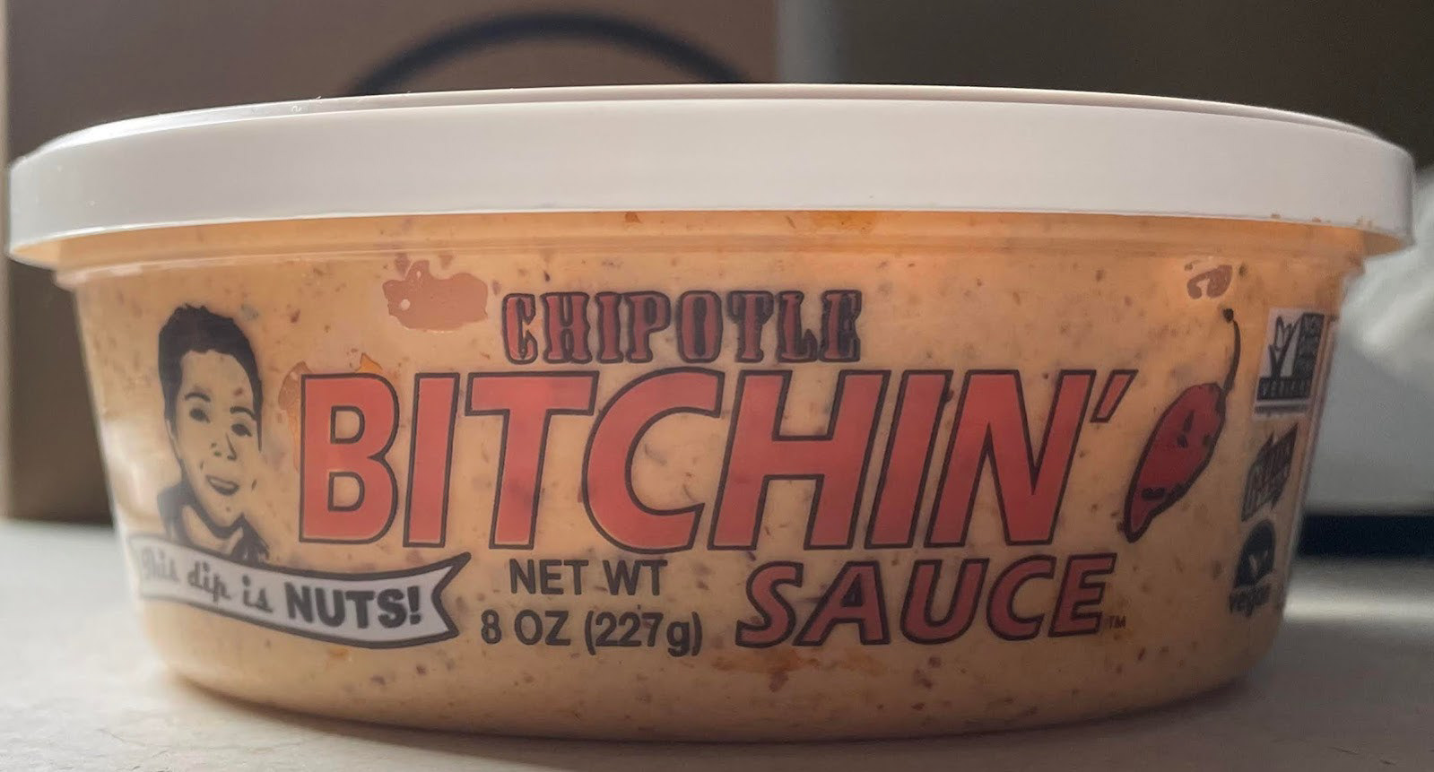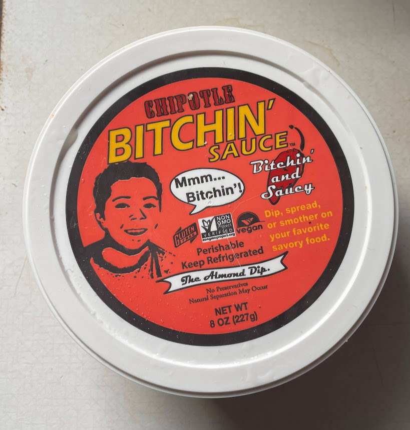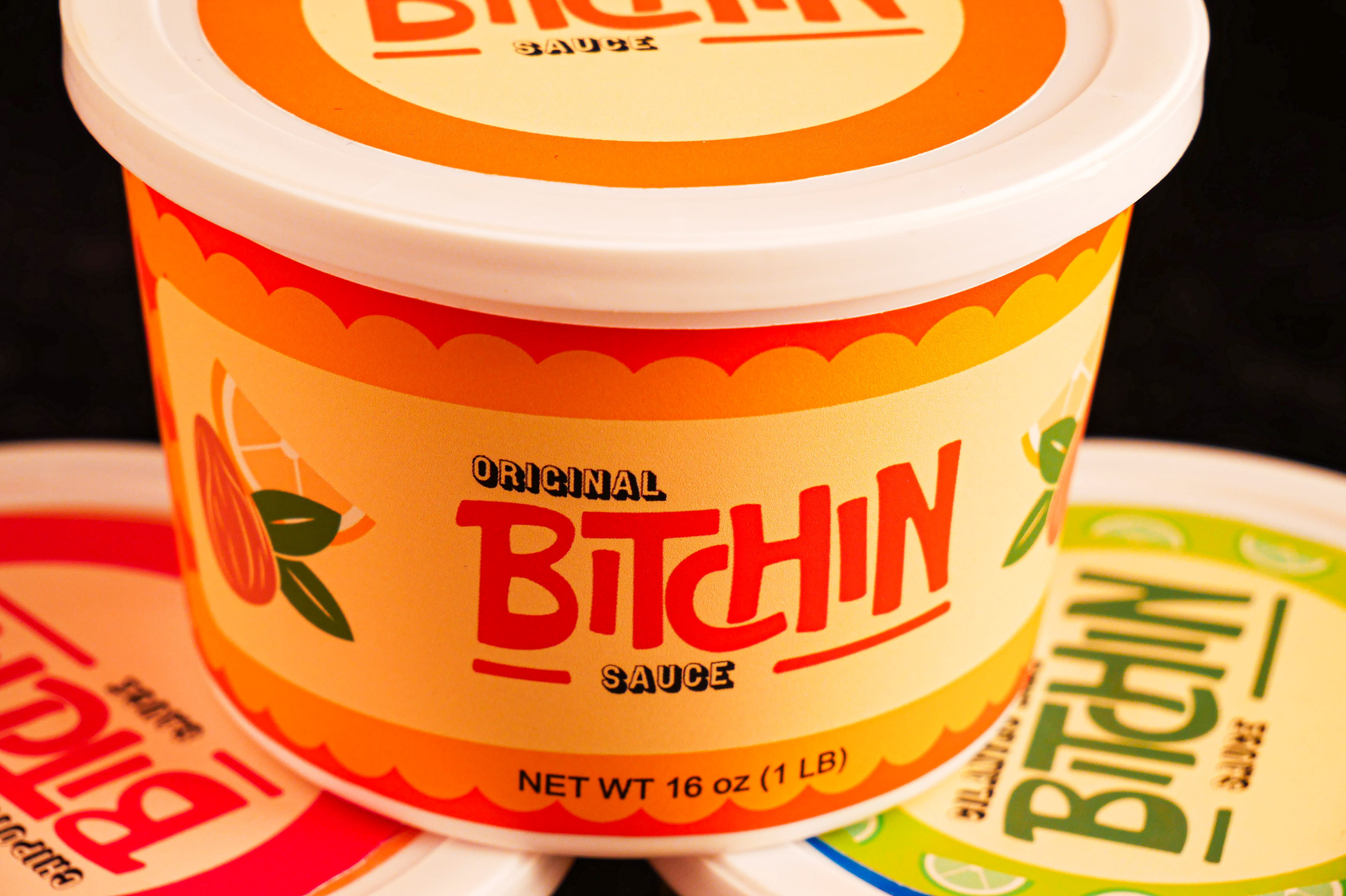
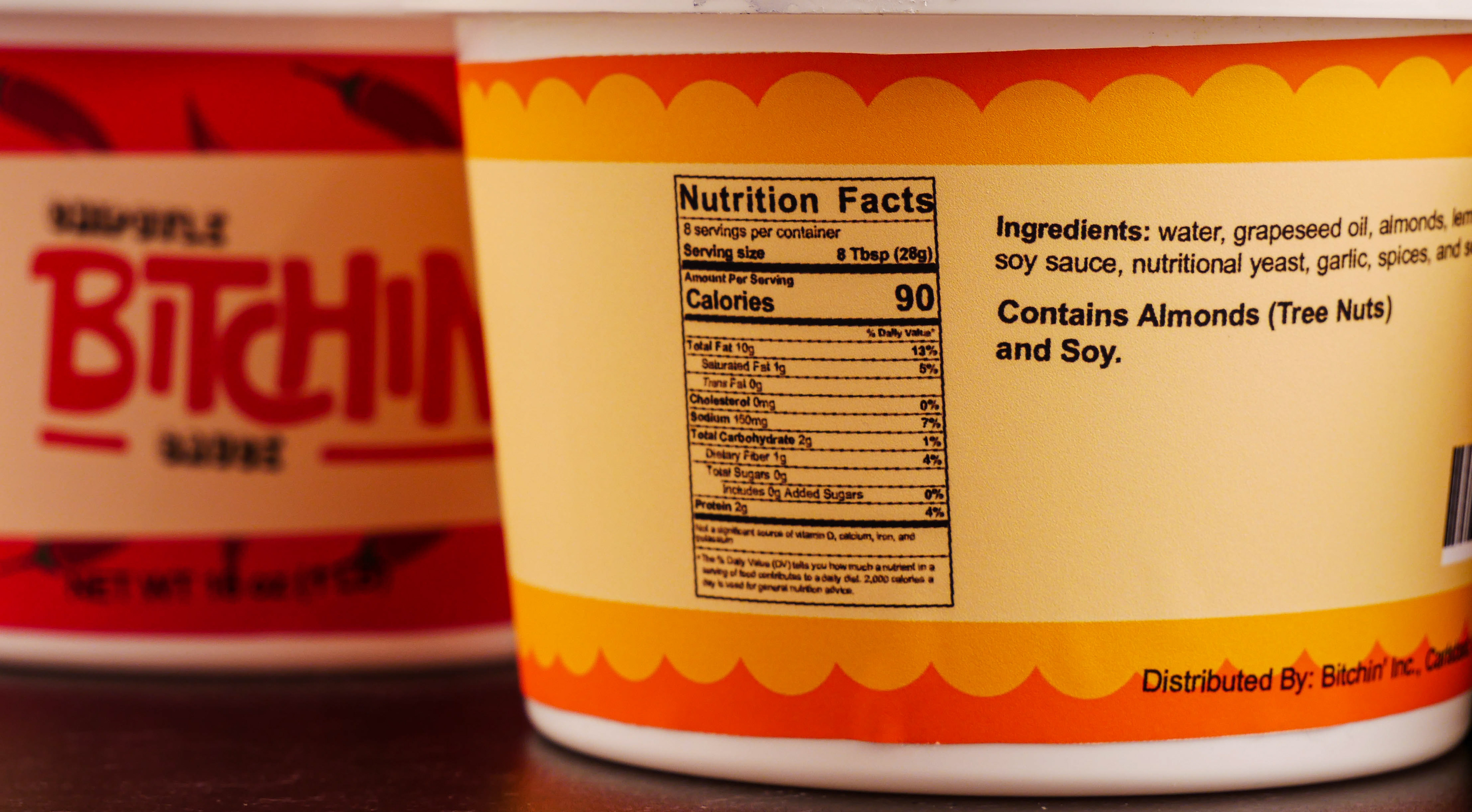
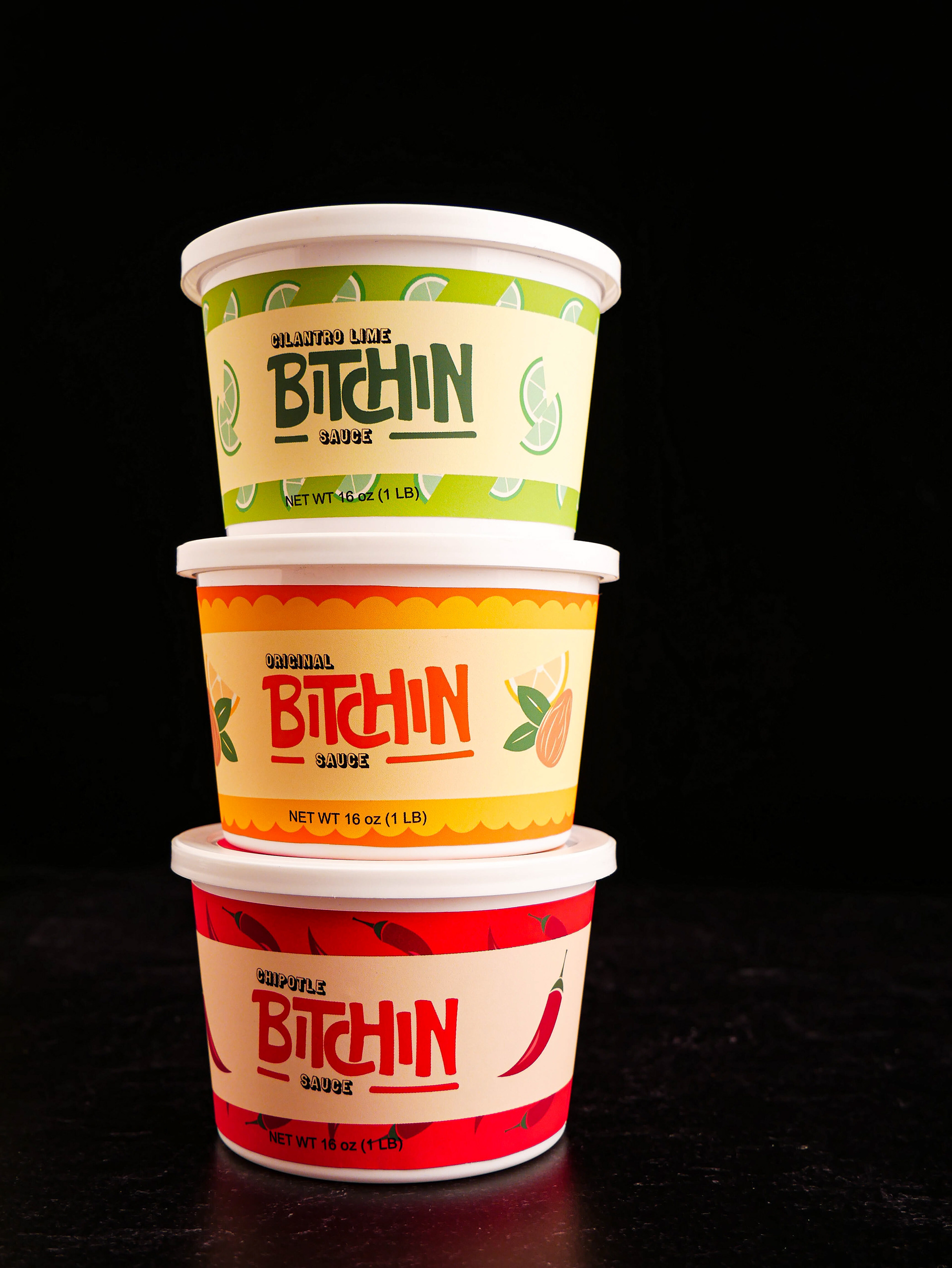
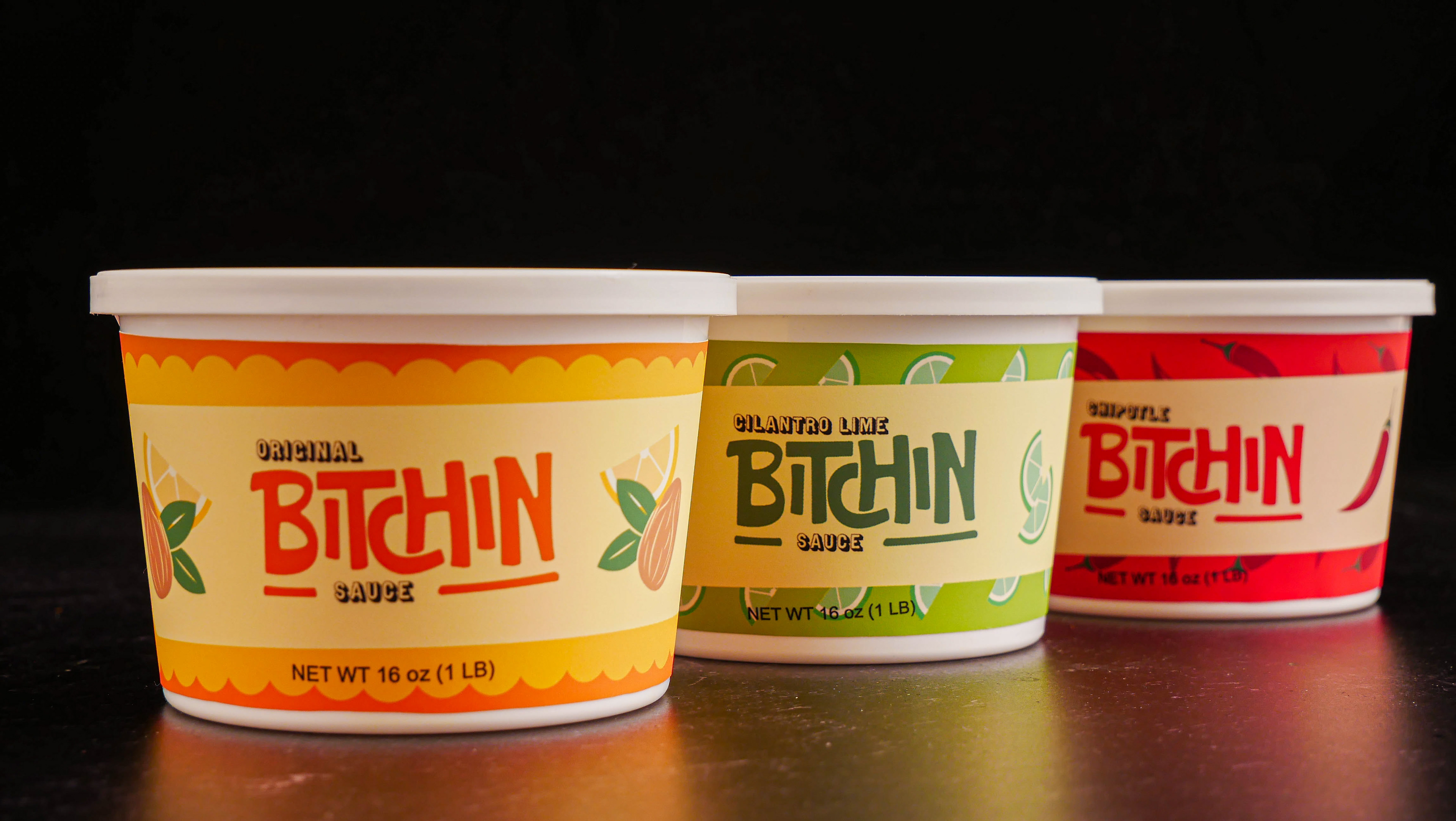
Bitchin’ Sauce is an almond based dip founded by Starr & L.A. Edwards who started selling their product at local farmers markets in San Diego. As a result of L.A.’s growing music career, the couple began touring all over the nation, bringing their sauce with them. Today, the couple still live a nomadic life with their children and bring their sauce wherever they go, hoping to make the world “a more bitchin’ place one tub at a time.” The sauce has even been picked up to be sold in stores like Target and Whole Foods, making the target audience for this product vegans or people who want to eat clean. This product could also be aimed at people who identify as hippies or nomads. I found that the original label was not giving that feeling to me. The name sticks out but not the label. The product caught my eye because of the name and how you usually don’t see the word “Bitch” on your food. As well as I don’t eat dairy so this product appealed to me even more. To me, the fonts and colors used are too boring and don’t really capture that essence. I would have not noticed this product if it wasn’t for the name. I also could not find the origin of the little boy on the label which makes his presence on the label even more confusing. I thought the label could be pushed more and I started thinking about how the word “Bitchin” could be a graphic itself. I took inspiration from graffiti, skate shops, surf shops, hookah lounges, etc to try and find that style I thought it deserved. It took a lot of playing around but ultimately I drew out a logo where all the letters were kind of bouncing around each other, like they were dancing or moving. The “TCH” creates some fun negative space, where the “C” cuts off the “H” and goes underneath it. The overall logo is balanced on the top and bottom and also creates an illusion that it’s rectangular. I also drew it out with the pen tool rather than finding a font for the word. I used WTR Gothic Open Shaded for the subtext because I was having a hard time finding a sans serif that complimented what I had made. I also wanted the font to be just as fun so I went with something shaded and I think it works very well together. As for colors, I kept them the same for the most part. The original label uses orange, red, and yellow but it is pretty washed out and does not stand out. I stuck with the orange but made it pop a little more as well as I added some yellow so it could be more eye-catching. The yellow also complimented the lemons I added to the label. Overall, I wanted to give the product more fun patterns and pops of color so it can be more eye-catching on the shelf. I also wanted the word “Bitchin’” to be more of the star since “Bitchin’” is their brand.
Before Rebrand:
